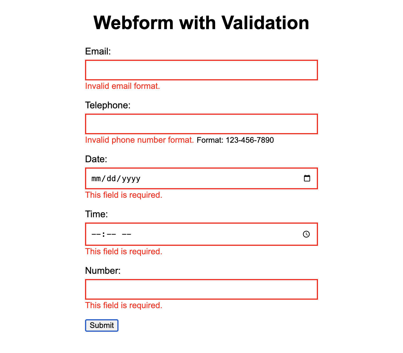
I was helping a student today with some form validation. She wanted a clean user interface, and great usability, and when an input type wasn't valid and/or when a field was left empty by the user, a red message should appear giving clear direction, but also a red border should decorate the specific field in order to draw attention to where the correction needed to be made.
Here is the resulting code with comments in case it's helpful to others as a clean, lightweight form validation solution using HTML, CSS, and Javascript with great usability and accessibility in mind. The HTML, CSS, and Javascript are all in one HTML file here but they can also be broken out using external .css and .js if preferred for your use case.
Below you can view a screenshot of how the completed webform should behave when activated:

Grab the Code on Github
Blogs aren't always the best or easiest ways to study code. If it's easier, I've added this code to a public Github Gist that I created. You can study the code below or go to Github for additional functionality with your own Github Desktop or other code management preferences.
The <head> section contains the css code to style the validation messages.
The <body> section contains the webform. Note you can turn novalidate on or off depending on if you want to test your custom validation messages and functionality.
The <script> section contains the Javascript to validate the webform on button click or tap.
Image(s): The wall of Stanley cups in a sports store in Chicago; screenshot of the working form; Greg O'Toole.

